The access to any technology, when analyzed on a scale of the world, is never universal. But out of all electronic devices, TVs are most worthy to be described as globally adopted. The common nature of television made it a popular target of comparison for emerging consumer devices, whether by marketing them as no more complex than using a remote control, adopting the broadcasting parlance, or both.
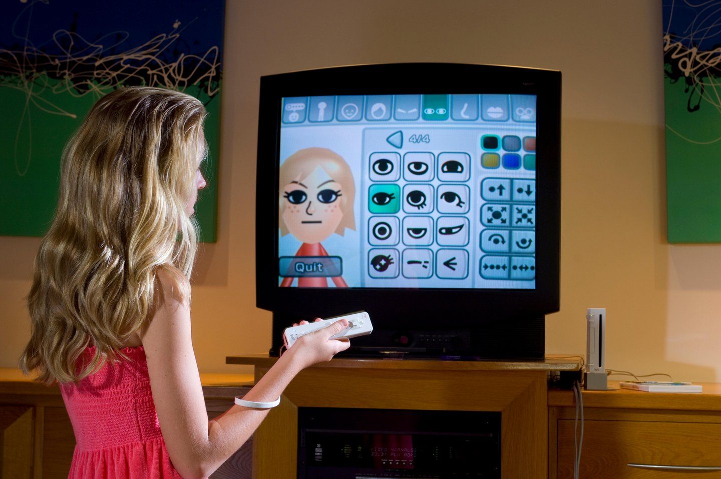
Nintendo’s Wii, a 2006 video game console, checked both boxes from the start. Its novel controller, the Wii Remote, undeniably looked like a cross between a TV remote and an iPod, while the controller’s pointer and motion capabilities introduced electronic entertainment to a plenty of people who wouldn’t otherwise touch video games.
But the extent to which the Wii relied on a television legacy suggests that Nintendo treated the TV better than just a device which popularity they needed to reach. The TV culture was also a source of inspiration, resulting in a user experience which would look out of place if not interconnected with the said culture.
“Companion to the Television”
The so-called seventh generation of game consoles, which the Wii was a part of, was the first one which got rid of the “press start” approach to the user interface. Inserting a game media into a console and powering it on, like it was done since the 1970s, could not be assumed anymore to be an integral part of the experience. A player could as well launch a game from the internal storage, use the console to play videos over the Internet, or even let it idle to download updates.
Facing the pressure from media appliances and computers, console manufactures had to turn their game-playing machines into multipurpose devices. User interfaces of their preceding products, as introduced five years prior seventh-generation consoles, were limited to save data managers and settings screens. However, Nintendo’s competitors beat it to the market with new interfaces. Sony’s XrossMediaBar menu system, used in the 2006 PlayStation 3, was first shipped with a DVR-game console combo almost three years before the new console’s launch. As for Microsoft, they found a way to stream their Windows Media Center made-for-TV platform to the original Xbox console from 2001.
To make up the leeway, Nintendo assembled a team led by Takashi Aoyama and Tomoake Kuroume, who had been responsible for video game menus and console startup screens. The team started their research with designing an on-screen keyboard, and then moved on to creating a way to select a venue for Wii’s programs and functions (which Aoyama described as “content outlets” in his panel talk at the Game Developers Conference in 2008).
“We thought if we succeed in creating a machine that people could think of as the companion to the television, this would be a great way to expand the user base. We never really thought of Wii as fighting with the television for consumers attention. Instead, we thought we could make watching television even more enjoyable,” he said.
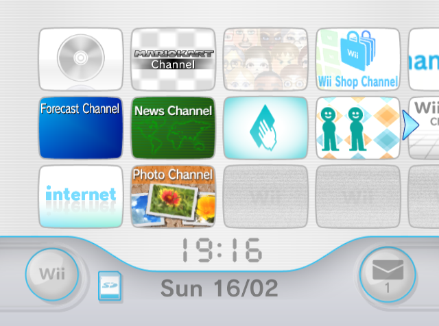
The idea of calling content outlets “channels,” as well as designing them up after TV screens, was coined after a remark by an unnamed Nintendo employee as the team settled on lining elements up. “Right then, someone casually said, neither as a complement nor as a criticism, ‘That's a TV channel,’ and that’s when it clicked,” said Kuroume in an Iwata Asks interview.
Dissecting the Channels
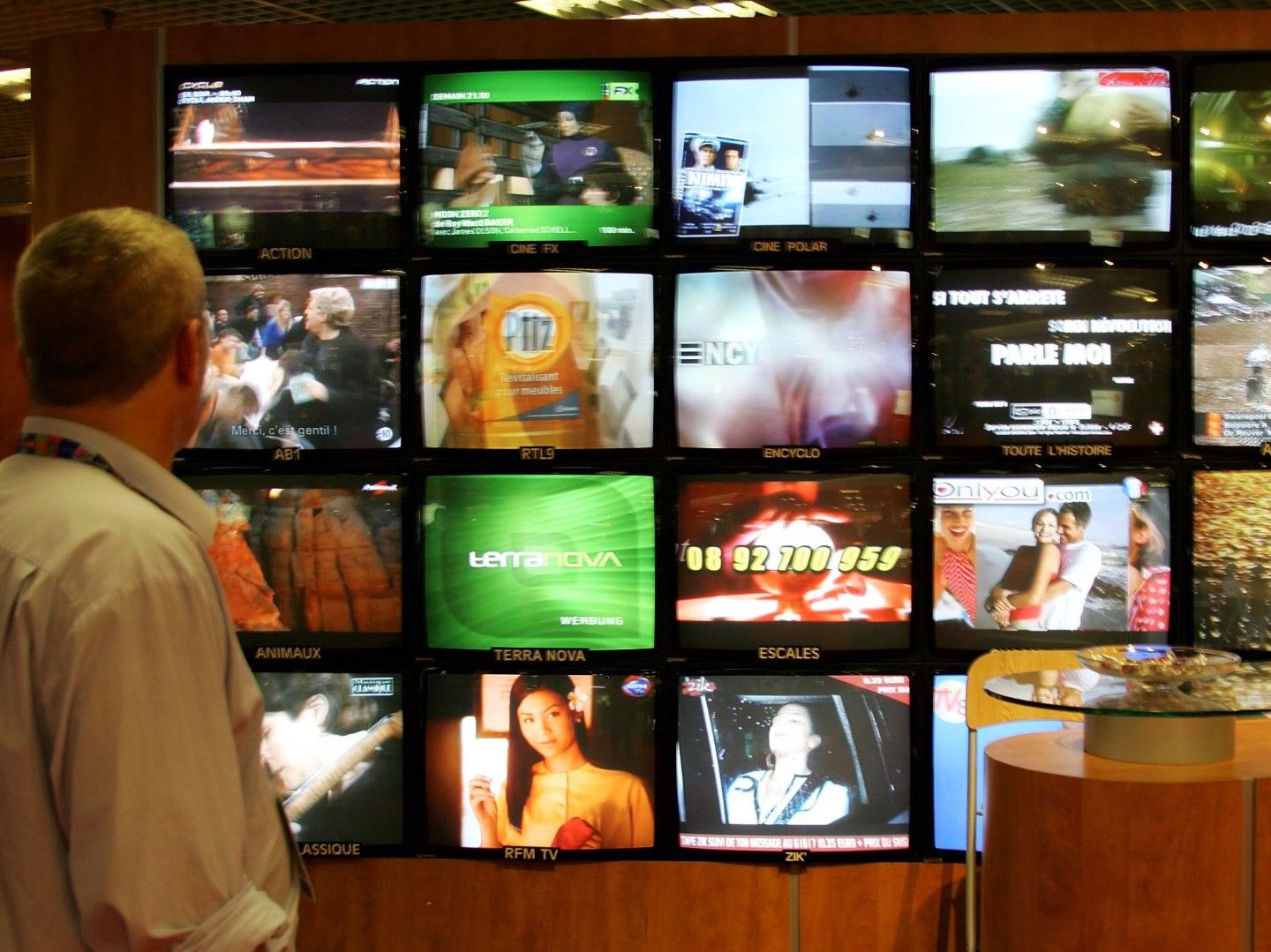
Channels published for the Wii included tutorial videos, game patches, and—only in Japan—a food delivery service. But out of all Wii channels, News and Forecast Channels highlight their TV lineage the most. In addition to fitting themes of their content (using a TV to check the weather or news makes too much sense), these channels used flashy transitions, chyrons, and other elements characteristic of news-based TV channels.
These channels, as well as other Wii software, are specific in their features to the audiovisual culture of Japanese TV, says Dr. Ryoko Sasamoto, an associate professor in the School of Applied Language and Intercultural Studies, Dublin City University. “In many ways, Japanese culture is very much visually oriented, and the Wii examples... definitely have similarities with the media practice in Japan,” she notes in an email interview with 30pin.

A researcher of telop (open captions used by Japanese broadcasts and variety shows), she made a note of a digital clock found in a top-left corner of Wii’s informational channels. According to Sasamoto, the feature has the same feel as the clock telop used on Japanese TV since 1956. “Japanese people do heavily rely on this time telop,” she said, describing that the clock mark is displayed at busy times of the day: early in the morning, at lunchtime and in the early evening. “It is changing now, but many Japanese families keep their TV when they are home, and having a clock on the screen really helps.”
Everybody Votes Channel, a mass online questionnaire released later in the Wii’s lifespan, was described by Sasamoto as having “the flavour of game shows and some news programmes,” considering its use of charts and the drum roll SFX. “The music is also very ‘NHK’!” she said, referring to Japan’s national broadcaster.
The Wii menu shares the font style with Japanese TV programming, as well as digital and print publications and public signage, says Kaihatsu, a pseudonymous YouTuber behind the Fontendo project which highlights fonts used in Nintendo products. “The reason this style of font seems to be everywhere in Japan is the same reason fonts like Futura, Univers and Helvetica enjoy wide usage here—it's a very modern, easy to read typeface which comes in many weights and looks good both in headings and longer pieces of text,” they note in a 30pin interview over the email.
The particular font used by Nintendo is Rodin NTLG (New Type Labo Gothic) by Fontworks, a foundry which sans serif Gothic fonts rose in popularity due to their “competitive pricing for smaller clients and individuals,” and due to the high quality of their Rodin font, notes Kaihatsu.
In the TV industry, NHK finalised the switch to a Rodin font for their clock telop in October 2007, according to an archived Q&A from their web site. Before that, some broadcasts used the segmented LCD font to display time. “Interestingly, the clock on the Wii menu uses an LCD font which may have been created to mimic the clock on NHK, as the change to Rodin happened after the Wii's release,” noted Kaihatsu. The clock was added to the Wii menu in an August 2007 update.
Keeping an Eye on the Competition
Nintendo’s strategy of capturing the market share, with a focus on new control schemes rather than drastically improved graphical fidelity, was different from the one of its peers. While concurrent consoles from Sony and Microsoft were by no means unsuccessful, the Wii surpassed them in popularity, surpassing more than 87 million units shipped by the sunset of the generation December 2012. That pushed Nintendo’s competitors into adopting some concepts popularized by the Wii—which, to a limited extent, included the channel metaphor.
Part of Sony’s original pitch for the PlayStation 3 was its raw processing power. To drive the point across, Sony collaborated with the Stanford University in creating a console client for its Folding@home distributed computing project. After the cooperation earned helped both parties set a Guinness world record, Sony updated the client with media features and news content, rebadging it as Life with PlayStation in 2008.
Life with PlayStation, just like Wii’s News and Forecast channels, spread out the data on a three-dimensional model of the Earth. Sony’s globe was more photorealistic than the one on the Wii, which earned the app a positive preview coverage. The content, however, was put to a limited use: there were no forecasts, no news slideshow, and the interface had no visual elements aside from the 3D globe. As a content channel, Life with PlayStation was more limited than what Nintendo offered.
Microsoft took a more media-centric approach by licensing existing TV show formats and offering their video game versions under an Xbox Live Primetime initiative. Games based on TV shows were nothing new by that point, but 1 vs. 100, the only game released under the program, was the first one to offer massive multiplayer, live events, and seasons—a combination of concepts popularised later by Fortnite and HQ Trivia. The free-to-play game for Xbox 360 console, based on am elimination quiz show of the same name, ran for two seasons from 2008 to 2009, with live sessions letting 101 players to compete for a stash of Microsoft store credit.
1 vs. 100, the only game ever run under the initiative, made such an impression on the gaming community, Microsoft reps were answering questions on the show’s potential comeback for years. In 2014, Dave McCarthy, General Manager for Lifestyle Entertainment at Microsoft Studios, told Polygon the company might do something like 1 vs. 100 for their then-new Xbox One system. More than six years later, Xbox head Phil Spencer hinted at making another trivia game “like from our past” for yet another next-generation Xbox Series consoles, as reported by VGC. None were released so far.
Cheating On the Silver Screen
The cultural partnership between the Wii U, Nintendo’s 2012 home video game console, was different than the one established by its bestselling predecessor. The Wii Remote was relegated to the status of a secondary controller, while the GamePad—a big, feature-packed, one-per-console controller—was billed as the Wii U’s defining feature.
The Wii U GamePad had its own 6.2-inch screen, as well as sensors used to evaluate its physical orientation. With game compilations like Nintendo Land or downloadable 360-degree panoramas, Nintendo pushed the GamePad as the means to see beyond the borders of a TV screen. Some games used the GamePad to display supplementary data, like maps and item lists, and most allowed to use the controller as a TV screen doubler. But multi-pane experiments like Star Fox Zero made players who ignored the GamePad screen in a disadvantageous position.
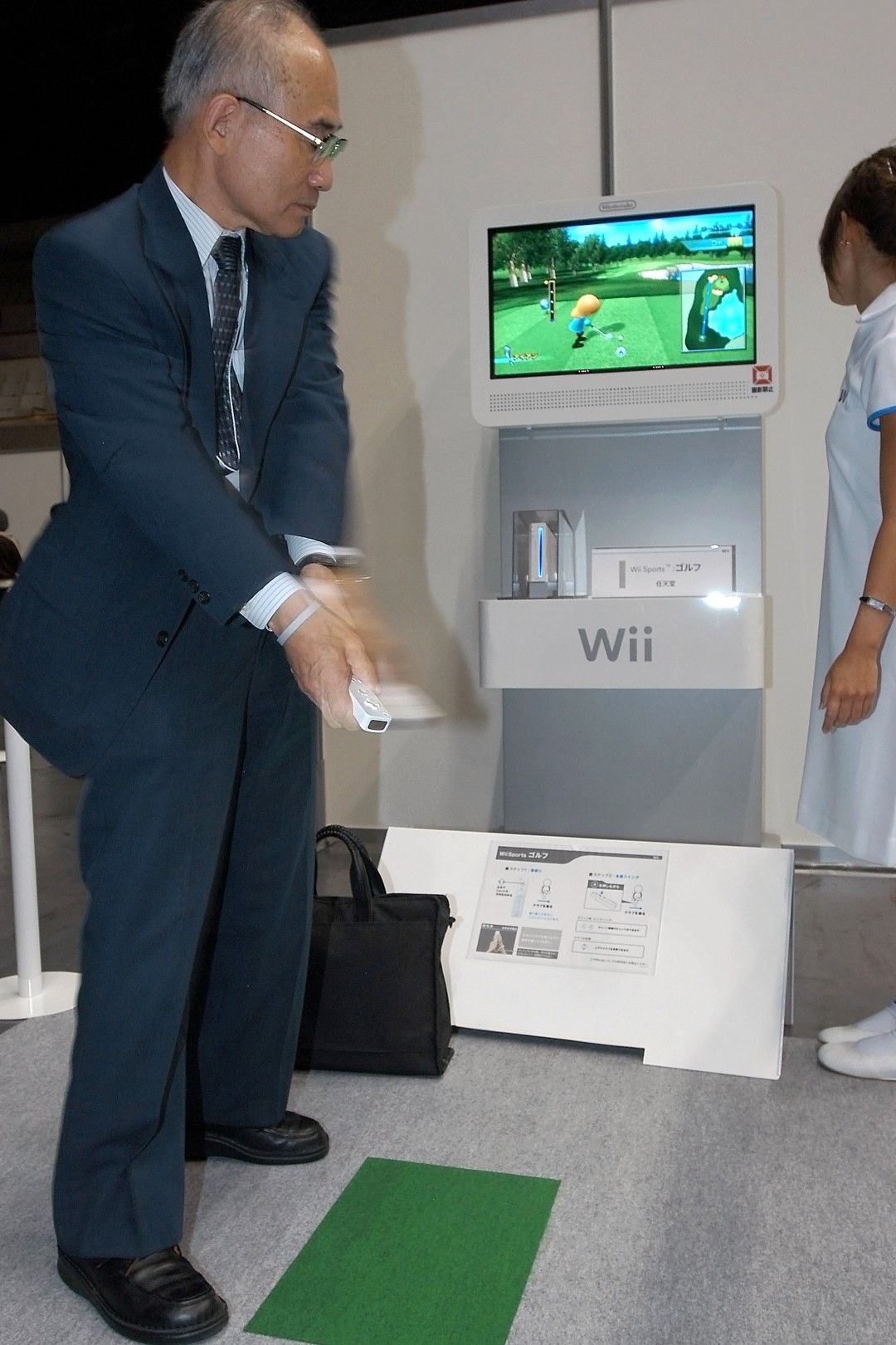
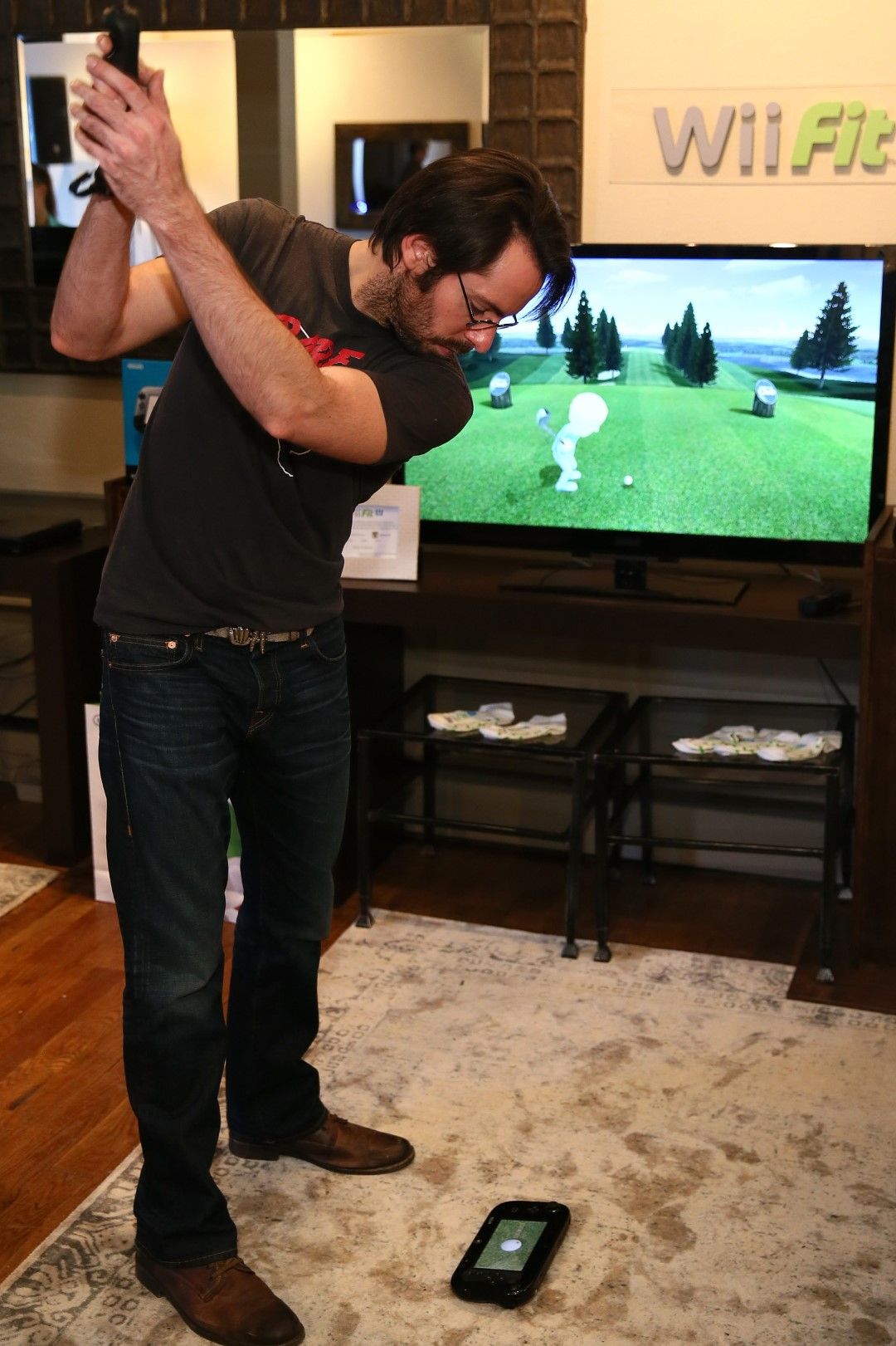
The relationship between the Wii U’s main controller and the TV was adversarial in a way not seen with the Wii or any conventional home game console. And yet, by the virtue of branding, the Wii U had to represent at least some part of the Wii experience. Nintendo, unlike its competitors in the early 2010s, chose to ensure that most commercial Wii games and peripherals could be used with their new console. The Wii U could even reboot into the “Wii Mode,” which presented the Wii menu to the player with minimal changes compared to the 2006 version.
The Wii Mode was used to launch games made for the Wii only, and the interface to run the Wii U software differed drastically from the wall of metaphorical TV sets. Gone was the concept of channels: the software installed to the Wii U was displayed as a grid of non-interactive icons. By default, the icon grid was moved away from the TV to the GamePad’s touch screen, turning it into a tablet as far as a basic selection experience goes.
Some principles which Wii developers swore upon were not followed through with the Wii U. Kuroume once called it “unacceptable” for Wii to display a user select screen upon startup. “If we chose to, we could allow each family member to have their own account. But that just isn’t what Wii is about,” he said in an Iwata Asks interview, unaware that the Wii U would do exactly that.
Down With the TV, Hooray for the Content
There was one thing that was aimed at maintaining the link between a TV and a new Nintendo console: the infrared port on the Wii U GamePad. Nintendo did experiment with ways to control a TV from the Wii, but the TV remote functionality of the GamePad marked the first time when said feature was shipped as an integral part of the experience. Since the GamePad had some processing power on its own, it could be used as a TV remote even when the console was off.
In the US, Canada and Japan, the IR blaster functionality was complimented by online TV listings provided by the Nintendo TVii app. The Western version of the free service provided a universal search across TV channels and streaming services, a sports tracker, and some social functions. Even though TVii was missing some features on its launch, the press coverage of the service was positive: Consumer Reports called it “terrific” while AP’s Ryan Nakashima described it as “an advance from the mass of buttons.” However, that didn’t prevent Nintendo from discontinuing TVii in North America in 2015, never offering it in Europe, and phasing out the Wii U in its entirety due to poor reception by 2017.
Focusing on TV content rather than elements of its presentation was in line with changes in TV usage. Upon the original Wii release in 2006, Netflix was still a DVD rental service, Google had just finalized the YouTube purchase, and TV sets which could stream local media guaranteed a hefty premium. Six years after, TVs themselves—just like game consoles before them—have started to assume functions of other computerized devices. Initial versions of smart TV platforms showered tube watchers with noisy, widget-laden user interfaces stripped off the traditional television decorum. For a moment, the wider visual entertainment industry seemed to be concerned more with collecting as many outlets as possible rather than with its presentation, just like the Wii U makers were concerned with encompassing every use case and control scheme possible.
On its first major attempt at making a general user interface, Nintendo captured the zeitgeist of television, both domestic and international, as the whole way of interacting with TVs was about to change. Its successor, in contrast, looked as if being pulled in different directions. But wasn’t “pulled in different directions” a spirit of early 2010s tech and media industries?

